Growth Marketing
29/5/2026
Quick audit: discover the levers of an e-commerce page that converts with a concrete before and after

There are pages that give an immediate impression of fluidity: you understand what is being proposed, you know what to do, and hesitation is dealt with before it even arises. The example of Promo (video creation service) is one of these pages, to the point of being retained by Unbounce in a selection of examples qualified as “high-converting”.
Unbounce presents this landing page as the number one example of its reference article, and indicates a 46.94% conversion rate, in the “Social Media” industry. The platform also specifies its framework: the pages of this selection have recorded at least 500 visitors and a conversion rate greater than 30%.
This figure is not a promise to be repeated. It mainly serves as a signal: in a given context, an assembly of choices (message, hierarchy, evidence, action) can produce a remarkable performance. So the interest is to look What is visible, What is consistent, and What is transposable to an e-commerce page, without overinterpreting.
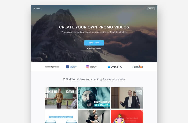
The screenshot associated with the example shows a very readable construction: a hero with video in mind, a simple headline (“Create your own promo videos”), a visible action button (“Start now”), then a logo area and a grid of examples (video thumbnails).
It's not just about aesthetics. This organization meets three basic needs on a conversion page:
In the Promo example, these three points are addressed early on: the message is explicit, the action is unique, and trust is nurtured by evidence.
The video is not a set, it is used as engagement engine. And the page mobilizes it at several levels: a video header, an “explainer” video and a series of examples.
Why can this approach work?
Because the video does two useful things, very quickly:
The presence of a grid of examples plays in the same direction: it transforms a promise into a concrete object.
At the same time, the action button is assumed: no detours. The page does not attempt to have a full argument read before the decision is made. It puts the user on a simple trajectory: see → understand → act.
The vocabulary is direct, the promise is accessible, and hierarchy reduces cognitive load. The page does not have to be “scholarly.” It needs to be understood.
The visible examples (thumbnails) are a piece of product. It's often more persuasive than a long paragraph.
Logos appear early, with the use of testimonies. The idea is not to pile up badges, but to provide a context of credibility at the moment when the decision is formed.
The video should be handled with caution: it can be harmful if it slows down the page, or diverts the attention of the CTA. In other words, what helps in one case may become a disability in another, especially on mobile.
There is another point of attention, more “structural”: a very efficient page can be so because it is distributed in a very targeted context (strong intention, simple promise, low friction).
Keep in mind that performance is as much about Offer/traffic/page coupling only on the page alone.
E-commerce has a particularity: the user does not buy “an idea”, he buys an object (or a product) with very concrete constraints: delivery, returns, size, compatibility, compatibility, warranty, guarantee, guarantee, delay, real use.
This is exactly where the Promo example comes in handy: it shows a way to deal with conversion not through persuasion, but through reduction of uncertainty.
On a product sheet, the first screen should answer four questions:
The Promo page puts these elements in place immediately (message, CTA, proofs).
In the example, the evidence is visible: logos, examples, testimonies.
On an e-commerce page, the equivalent is:
This point is confirmed by UX recommendations: nnGroup explains that generic “Get Started” CTAs can create uncertainty when the real action is not clear.
In e-commerce, this calls for explicit CTAs (“Add to cart”, “Choose my size”, “Order”) and very clean management of variants.
The objective here is not to “redo a page” in the complete design sense, but to correct what, in most cases, is blocking the conversion.
Reorder the top of the page
Eliminate micro frictions
Add a “who serves” proof
Dealing with objections
Minimum measurement
Remember two useful guidelines:
For an e-commerce page, the result of a “48-hour” upgrade can often be read first of all on intermediate metrics: add to cart, CTA click, Decrease in exits, Increased reading of the evidence. The final figure will depend on traffic, price, seasonality, and logistics, which the source does not document in this case.
The Promo example is not interesting because it is “at 46.94%”. It is interesting because it illustrates, with great clarity, a simple idea: a powerful page Do not ask the user to have faith. She quickly gives him something understand, of what believe, and an obvious way To act.
And that's exactly what many e-commerce pages can improve in 48 hours: less speech, more evidence, a shorter path.
3 Boulevard de Sebastopol, 75001, Paris
©Copyright 2024. All rights reserved.
If you want to keep in touch, and get a summary of Growth Marketing every week, it's just happening here 👇